
UX/UI
School Project
Fall '24
Mobile App Redesign For ATH.ENA
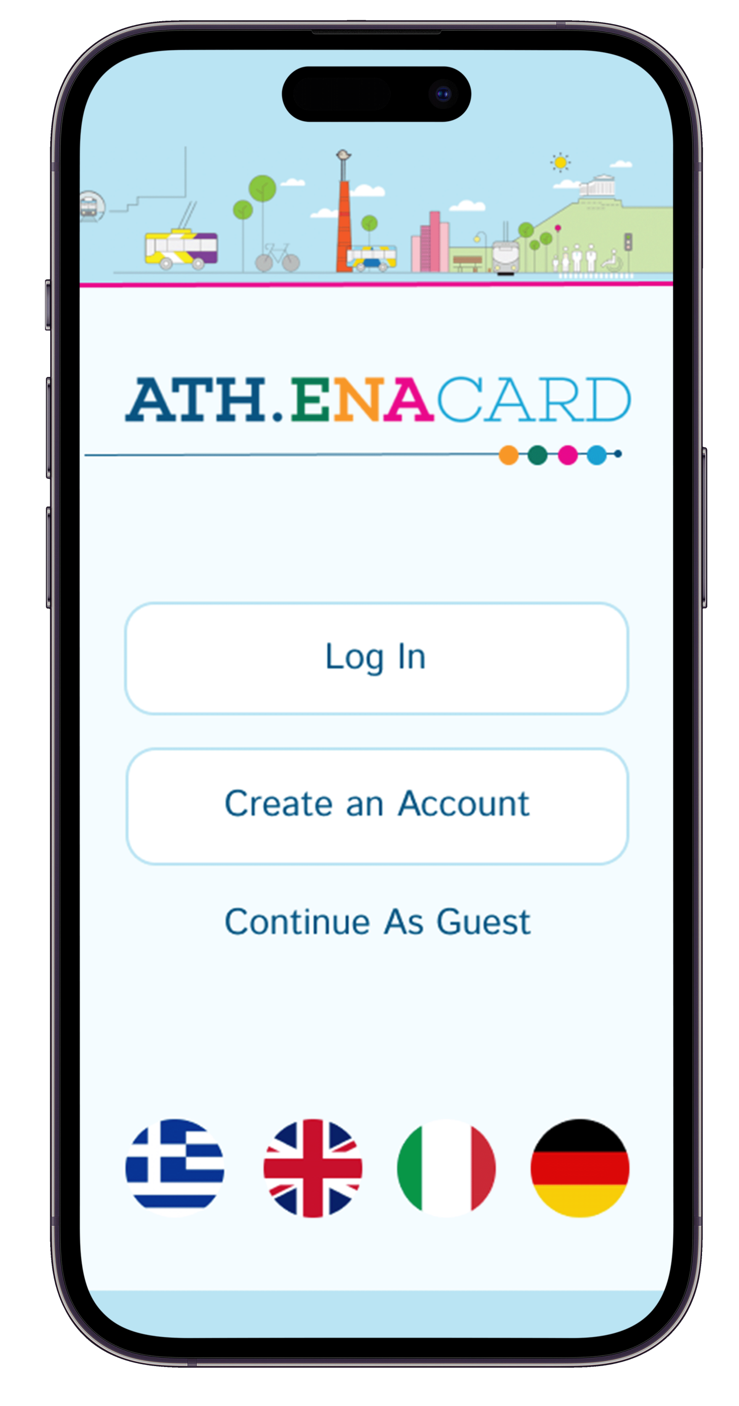
Description: In an attempt to make the ATH.ENA ticketing app more accessible and user-friendly, we are preforming a complete app redesign.
Goals and Objectives: Currently the app is only available for Android users, and even the Android users are not using the app because it is more difficult to use then the physical ticket kiosks. This redesign will allow users on all phone types to use the app, and will be more accessible and user-friendly. This will allow more people to access the app and continue to use it over the physical ticket kiosks.
Research
1. Analyzing Competitor Apps
2. Conducting User Testing on Competitor Apps
3. Conducting In-person Observations of an Athens Ticket Kiosk
4. Creating a User Journey of the Process of Using a Ticket Kiosk (see below)

User Journey: Things I Noticed
1. Offered in severeal different languges
2. Several different options of what you can do with your card all worded similarly
3. Can’t find ticket prices until you click on a specific one, which takes up time
4. Somewhat unclear on which tickets can only be used in certain areas
Goals
1. Overall accessibility
2. Easy to navigate in a rush
3. Easy to understand for people unfamiliar with Athens' transportation system
4. Fix issues I noticed from the user journey
Sketches


Wireframes


UI Design


